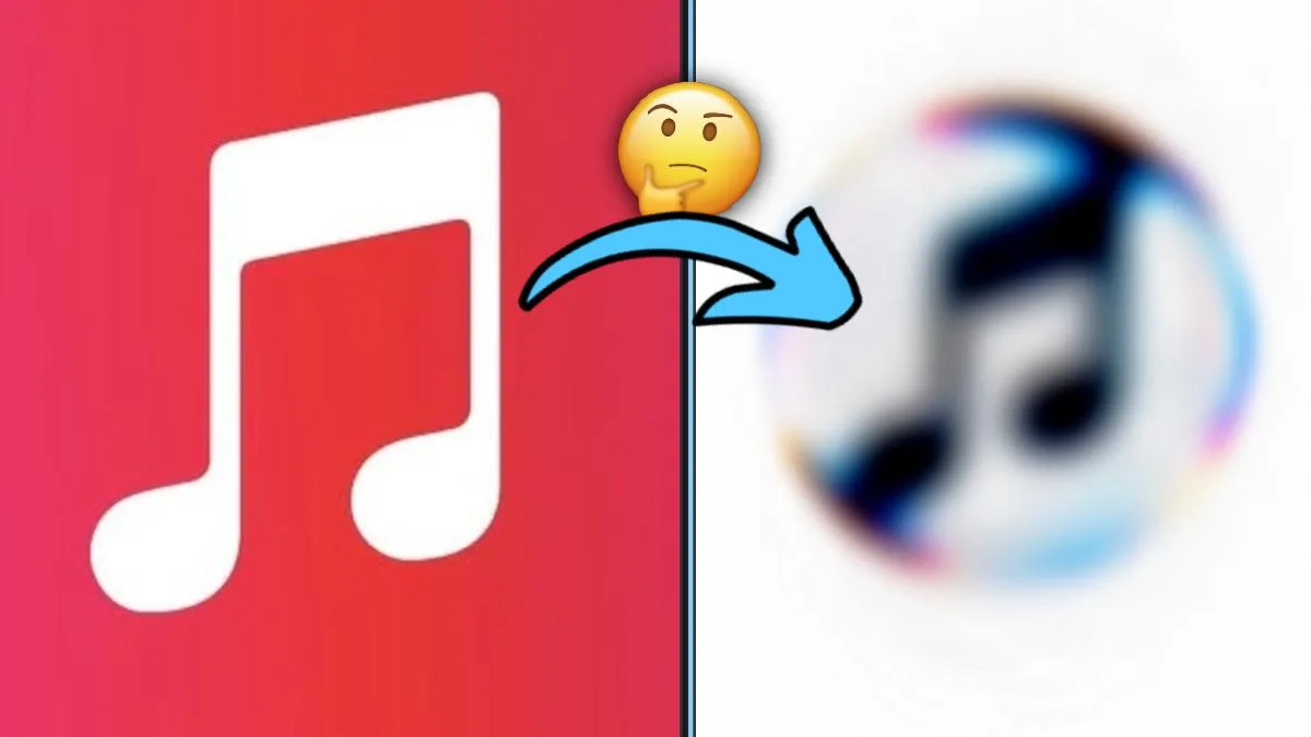

Apple has officially announced a sweeping rebrand of its music streaming service, Apple Music — and the most visible change is a brand-new logo that retires the red color that has defined the platform for years.
The move didn't come as a surprise. Fragments of the new visual language had been appearing in the company's software betas since the beginning of October. Now, with an official launch video, the full design is out in the open.
A logo shaped by sound
Apple's design method is nearly as interesting as the result. The company passed specific audio frequencies through a container filled with water. Apple Music brand elements were placed behind the rippling liquid, and the waves created by the notes transformed the reflections into a dynamic, fluid form.
The liquid-inspired approach lines up neatly with Liquid Glass, the interface architecture introduced with iOS 26 and macOS Tahoe. Apple emphasizes that the new visuals were generated directly "by the sound itself."
Farewell to red, hello to black and white
The most fundamental change came in the color palette. Apple Music's distinctive red has been dropped entirely; the app icon and visuals now use a black-and-white scheme. In light mode, the logo will appear in black on a white background, while dark mode shows a white logo on black.
The visual identity comes with an audio identity to match. Apple partnered with British producer Fred Again and NEST Acoustics, and the brand's custom jingle and sonic signature were composed by the duo.
When is it rolling out?
The new logo and icons won't arrive in a single update; they will spread across the ecosystem gradually. The full rollout is expected with iOS 27.2 and macOS 27.2, which Apple plans to release in the coming weeks.




Comments (0)
No comments yet. Be the first!