
YouTube is trying out three different icons in a new version of its Android app. The logos haven't been rolled out to users yet; they're still in testing.
The discovery was made by the Android Authority team while examining the app's latest version. All three icons depart noticeably from the YouTube logo we know.
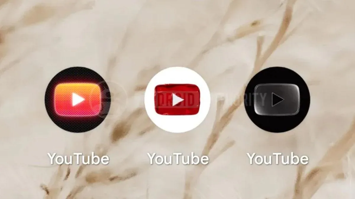
Three different designs
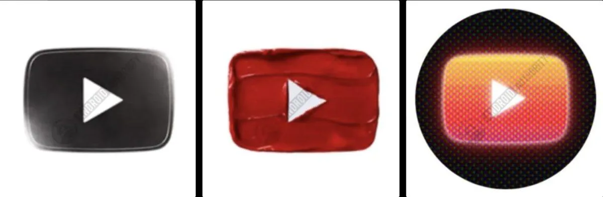
The first icon is a simplified take on the current logo, with a monochrome color scheme and subtle shading.
The second icon features a texture, resembling a layer of cream or spilled paint.
The third icon leans into nostalgia. Its layered structure and pronounced CRT effect evoke old cathode-ray tube TV screens.
Personalization or Premium perk?
The purpose of the logos hasn't been officially explained. However, a "preferences" section in the update package suggests the icons could be offered to users as selectable options.
It remains unclear whether the feature will be available to all users or exclusively to YouTube Premium subscribers. There's no broad release date yet for the feature, which is still in testing.

Comments (0)
No comments yet. Be the first!