

Google Translate, the world's most widely used translation tool, is getting a substantial visual overhaul on Android. Interface changes first spotted in July have now begun appearing on some users' devices, more than three months later, under version number 10.39.34.99.
Don't expect the update to hit every Android phone right away. The rollout is known to be happening gradually, so it may take a while before the new design shows up on your device.
What looks different?
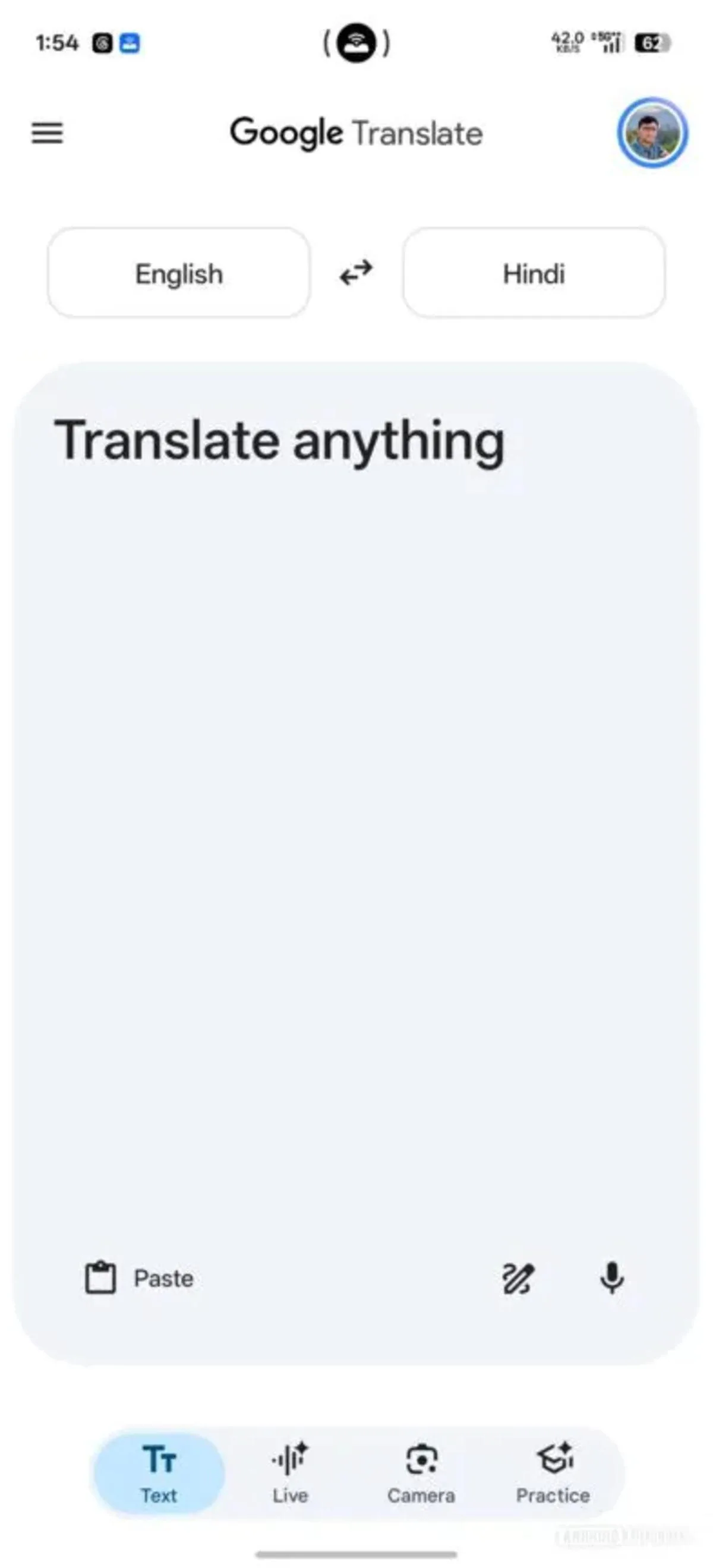
The most immediately noticeable change is the menu bar at the bottom of the app. The new bottom bar closely follows the design language of current Google apps such as Google Lens and Google Photos. Across the interface, Google has also adopted a color palette close to the blue tones familiar from the Play Store.
There's a notable difference between the concept that surfaced in July and the version now rolling out, though. The text input card sitting between the language selection bar and the bottom menu has been visibly enlarged in the current release. That expansion has directly changed the menu layout and the position of several icons.
The three-dot menu is gone
The three-dot menu button, which offered translation model selection and access to handwriting mode, has disappeared entirely in the new design. The handwriting option now lives inside the text box, right next to a slightly refreshed microphone icon, while the paste button has moved to the left side of the box.
The larger text box does come with a downside. Because the expanded area takes up more of the screen, the remaining space shrinks and contextual shortcuts can no longer be displayed.



Comments (0)
No comments yet. Be the first!